Complete Guide: Figma MCP + Cursor + Drupal 11 UI Patterns Workflow

Introduction
This guide walks you through setting up an automated design-to-code workflow that transforms Figma designs into fully functional Drupal 11 Single Directory Components (SDC) using the Model Context Protocol (MCP) and Cursor IDE.
What you'll achieve:
- Extract component specifications directly from Figma Dev Mode
- Automatically generate Drupal UI Pattern components (YAML, Twig, CSS)
- Maintain design-code parity with minimal manual coding

Prerequisites
Required Accounts & Tools
- Figma Dev account (Pro plan or higher for Dev Mode)
- Command line access (Terminal on Mac/Linux, PowerShell/CMD on Windows)
- Cursor IDE - Download here
- DDEV - Installation guide
Verify Prerequisites
# Check DDEV installation
ddev version
Part 1: Local Drupal Development Setup
1.1 Install Drupal 11 with DDEV
# Create project directory
mkdir drupal-figma-project
cd drupal-figma-project

# Initialize DDEV for Drupal 11
ddev config --project-type=drupal11 --docroot=web --create-docroot

# Start DDEV
ddev start

# Install Drupal 11 using Composer
ddev composer create drupal/recommended-project

# Install Drupal via Drush
ddev drush site:install standard --site-name="Figma MCP Demo" --account-name=admin --account-pass=admin --yes

# Launch the site
ddev launch
Login credentials:
- Username:
admin - Password:
admin
1.2 Install Required Modules
# Install modules via Composer
ddev composer require drupal/gin drupal/gin_toolbar drupal/ui_patterns drush/drush

# Enable gin
ddev drush theme:enable gin

# Enable modules
ddev drush en gin_toolbar ui_patterns ui_patterns_library ui_patterns_layouts -y

# Set Gin as admin theme
ddev drush config-set system.theme admin gin -y

# Clear cache
ddev drush cr
Part 2: Create Custom Theme
2.1 Generate Subtheme Using Starterkit
# Navigate to themes directory
cd web/themes

# Create custom themes directory
mkdir -p custom
cd custom

# Generate subtheme from Starterkit (Drupal 11 core theme)
php ../../core/scripts/drupal generate-theme bonnici --name "Bonnici Theme" --description "Custom theme for Figma MCP workflow"

# Return to project root
cd ../../..
2.2 Verify Theme Structure
# Check theme was created
ls web/themes/custom/bonnici
You should see: bonnici.info.yml, bonnici.theme, css/, etc.
Part 3: Generate Initial SDC Component
3.1 Generate Hero Component Scaffold
# Generate SDC component
ddev drush generate sdc

# Alternative: Create manually
mkdir -p web/themes/custom/bonnici/components/hero
3.2 Create Initial Component Files
# Navigate to component directory
cd web/themes/custom/bonnici/components/hero
Create hero.component.yml:
$schema: https://git.drupalcode.org/project/drupal/-/raw/11.x/core/modules/sdc/src/component.schema.json
name: Hero
status: experimental
props:
  type: object
  properties:
    title:
      type: string
      title: Title
    subtitle:
      type: string
      title: Subtitle
    button1_text:
      type: string
      title: Button 1 Text
    button1_url:
      type: string
      title: Button 1 URL
    button2_text:
      type: string
      title: Button 2 Text
    button2_url:
      type: string
      title: Button 2 URL
Create hero.twig:
# Not this will be empty
Return to project root:
cd ../../../../..
Part 4: Figma Setup
4.1 Install Figma Desktop App
Download and install from: https://www.figma.com/downloads/
4.2 Create Hero Component in Figma
- Open Figma Desktop and create a new file named "Drupal Components"
- Create a Frame (press
For use Frame tool)- Name it "Hero"
- Set width: 1440px, height: 600px
- Add Title Text
- Press
Tfor text tool - Type: "Bonnici"
- Font size: 48px, Weight: Bold
- Press
- Add Subtitle Text
- Add another text layer below title
- Type: "Creators of Drupal"
- Font size: 20px, Color: #666666
- Add Button 1 (Primary)
- Create a rectangle (press
R) - Width: 160px, Height: 48px
- Fill: #0066CC, Border radius: 8px
- Add text on top: "Get Started"
- Create a rectangle (press
- Add Button 2 (Secondary)
- Duplicate button 1
- Change fill to transparent
- Add border: 2px, #0066CC
- Change text: "Learn More"
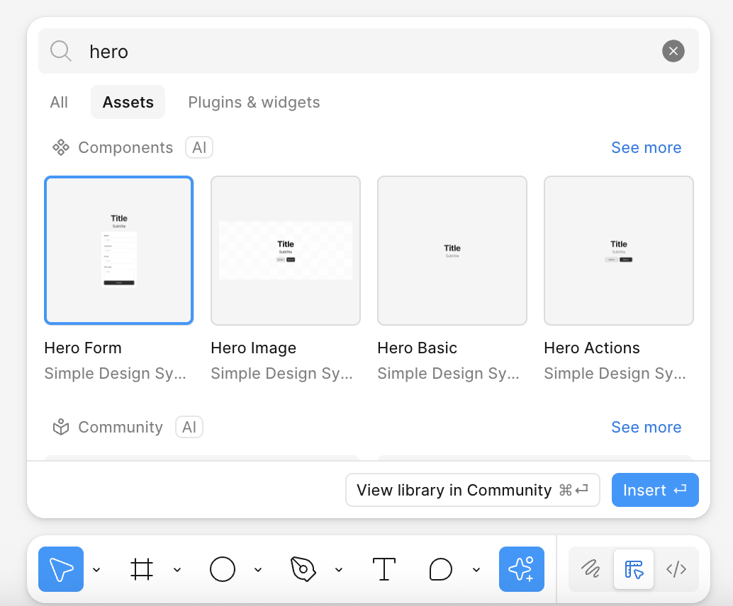
Or you could just choose a predefined hero like I did to test with:
4.3 Enable Dev Mode and MCP Server
-
Enable Dev Mode
- Click "Dev Mode" in top-right corner of Figma
- Select your Hero frame
- Click "Copy link" in the Dev Mode panel
-
Enable Figma MCP Server
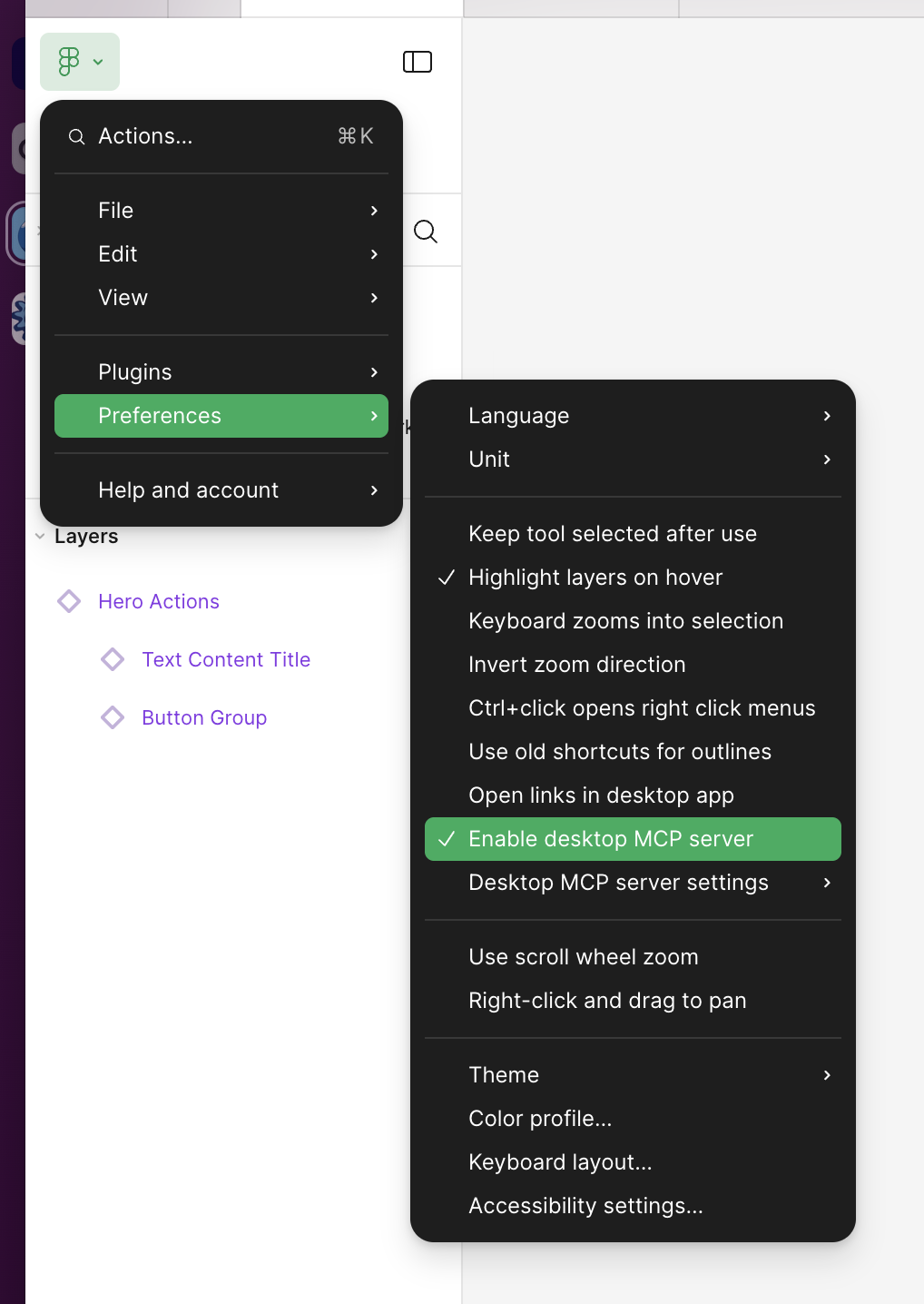
- Open your Figma desktop app.
- Click on the Figma icon in the top-left corner, go to Preferences, and select Enable Dev Mode MCP Server. (If this option isn’t visible, ensure your Figma app is updated.)
Note: MCP Server runs locally, requiring the desktop app, not available on the web version.
4.4 Copy Your Dev Mode Link
Your link should look like:
https://www.figma.com/design/ABC123/Drupal-Components?node-id=1-2&m=dev
Part 5: Cursor IDE Setup
5.1 Configure MCP Server in Cursor
- Open Cursor IDE
- Open Settings:
- Mac:
Cmd + , - Windows/Linux:
Ctrl + ,
- Mac:
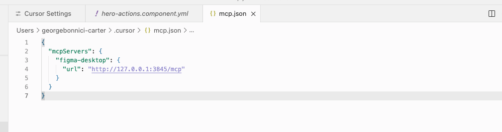
- Search for "MCP" or navigate to Extensions → MCP
- Click "Edit in settings.json"
- Add this configuration:
{
  "mcpServers": {
    "figma": {
      "url": "http://127.0.0.1:3845/sse"
    }
  }
}
- Save and restart Cursor
5.2 Verify MCP Connection
- Open Cursor's AI chat (Cmd/Ctrl + L)
- Type: "List available MCP servers"
- You should see "figma" listed
Part 6: Import Hero from Figma
6.1 Open Your Project in Cursor
# Open project in Cursor
cursor drupal-figma-project/
6.2 Navigate to Your Component
In Cursor's file explorer:
web/themes/custom/bonnici/components/hero/
6.3 Set Up the AI Prompt Template
Open Cursor AI chat (Cmd/Ctrl + L) and paste this configuration prompt:
I have a component in YAML that I use with Drupal UI Patterns. Study this file and use it as a basis.

When I give you a component (via YAML or via a Figma Dev Mode link), I want you to automatically create a complete setup with:

1. The `.component.yml` file with all properties that are present in Figma (e.g., title, description, buttons, images, …).
2. A `.twig` file in which those properties are correctly displayed.
3. A `.css` file in which the styling happens, as much as possible resembling the Figma design.
4. Everything together in its own folder per component (e.g., `/components/[component-name]/`).

⚠️ Important:
- If there are multiple variants or multiple buttons in Figma, also add multiple properties (e.g., `button1_text`, `button2_text`, …).
- Make sure the Twig only shows something if the property is filled in.
- Use semantic HTML and clean CSS classes (e.g., `.hero__buttons`).
- Put buttons and variants nicely next to each other with flexbox or grid, so the design matches Figma.

Always stick to the Drupal UI Patterns structure:
- `[component].component.yml`
- `[component].twig`
- `[component].css`
The files should be placed in: web/themes/custom/bonnici/components/hero/
It should look something like this:
hero.component.yml:
$schema: https://git.drupalcode.org/project/drupal/-/raw/11.x/core/modules/sdc/src/component.schema.json
name: Hero
status: experimental
props:
  type: object
  properties:
    title:
      type: string
      title: Title
    subtitle:
      type: string
      title: Subtitle
    button1_text:
      type: string
      title: Button 1 Text
    button1_url:
      type: string
      title: Button 1 URL
    button2_text:
      type: string
      title: Button 2 Text
    button2_url:
      type: string
      title: Button 2 URL
hero.twig:
<div class="hero">
  {% if title %}
    <h1 class="hero__title">{{ title }}</h1>
  {% endif %}

  {% if subtitle %}
    <p class="hero__subtitle">{{ subtitle }}</p>
  {% endif %}

  {% if button1_text or button2_text %}
    <div class="hero__buttons">
      {% if button1_text and button1_url %}
        <a href="{{ button1_url }}" class="hero__button hero__button--primary">
          {{ button1_text }}
        </a>
      {% endif %}

      {% if button2_text and button2_url %}
        <a href="{{ button2_url }}" class="hero__button hero__button--secondary">
          {{ button2_text }}
        </a>
      {% endif %}
    </div>
  {% endif %}
</div>
hero.css:
.hero {
  padding: 4rem 2rem;
  text-align: center;
  max-width: 1200px;
  margin: 0 auto;
}

.hero__title {
  font-size: 3rem;
  font-weight: 700;
  margin-bottom: 1rem;
  line-height: 1.2;
}

.hero__subtitle {
  font-size: 1.25rem;
  color: #666;
  margin-bottom: 2rem;
}

.hero__buttons {
  display: flex;
  gap: 1rem;
  justify-content: center;
  flex-wrap: wrap;
}

.hero__button {
  padding: 0.75rem 2rem;
  border-radius: 0.5rem;
  font-weight: 600;
  text-decoration: none;
  transition: all 0.2s;
  display: inline-block;
}

.hero__button--primary {
  background-color: #0066cc;
  color: white;
}

.hero__button--primary:hover {
  background-color: #0052a3;
}

.hero__button--secondary {
  background-color: transparent;
  color: #0066cc;
  border: 2px solid #0066cc;
}

.hero__button--secondary:hover {
  background-color: #f0f0f0;
}
6.4 Import from Figma
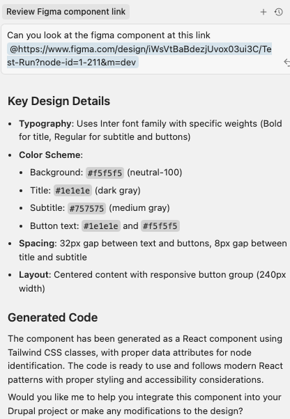
Now give Cursor the command with your Figma Dev Mode link:
Using the Figma MCP server, fetch the component from this Dev Mode link and update the hero component files:

[YOUR FIGMA DEV MODE LINK HERE]

Update the existing files in web/themes/custom/bonnici/components/hero/ to match the Figma design exactly.
Cursor will:
- Fetch design specs from Figma via MCP
- Extract colors, typography, spacing, layout
- Update your
.component.yml,.twig, and.cssfiles - Match your Figma design as closely as possible
Part 7: Enable in Drupal
7.1 Clear Cache and Enable Theme
# Clear Drupal cache
ddev drush cr

# Enable your custom theme
ddev drush theme:enable bonnici -y

# Set as default theme
ddev drush config-set system.theme default bonnici -y

# Clear cache again
ddev drush cr
7.2 Verify Component in UI Patterns Library
- Login to Drupal:
ddev launch - Navigate to: Appearance → Bonnici → UI Patterns
- Find your theme: "Bonnici Theme"
- Verify: You should see your "Hero" component listed
- Click "View" to see the component preview
Part 8: Enable Layout Builder
8.1 Enable Layout Builder Module
# Enable Layout Builder and dependencies
ddev drush en layout_builder layout_discovery -y

# Clear cache
ddev drush cr
8.2 Enable Layout Builder for Content Type
- Navigate to: Structure → Content types → Basic page → Manage display
- Check: "Use Layout Builder"
- Check: "Allow each content item to have its layout customized"
- Click: "Save"
8.3 Create a Test Page
- Navigate to: Content → Add content → Basic page
- Fill in:
- Title: "Homepage"
- Body: (optional)
- Click: "Save"
8.4 Add Your Hero Component
- On your new page, click "Layout" tab
- Click: "Add block" in the content region
- Search for: "Hero" or find under "UI Patterns"
- Click: "Add block"
- Configure the block:
- Title: "Welcome to Our Platform"
- Subtitle: "Build amazing experiences with our powerful tools"
- Button 1 Text: "Get Started"
- Button 1 URL: "/contact"
- Button 2 Text: "Learn More"
- Button 2 URL: "/about"
- Click: "Add block"
- Click: "Save layout"
Part 9: View Your Component
Navigate to your page and you should see your Hero component rendered with:
- ✅ Figma-matching styles
- ✅ Proper spacing and typography
- ✅ Functional buttons
- ✅ Responsive layout
Troubleshooting
MCP Server Connection Issues
# Check if server is running
curl http://127.0.0.1:3845/sse
Component Not Showing in UI Patterns
# Rebuild cache
ddev drush cr

# Check component schema
ddev drush sdc:list

# Validate YAML syntax
cat web/themes/custom/bonnici/components/hero/hero.component.yml | grep -v "^#"
Figma Link Not Working
- Ensure you're using the Dev Mode link (not regular share link)
- Link must include
m=devparameter - Your Figma file must be accessible with your Personal Access Token
Wow, is this cool. Design to code has never been so fast. Now the mind races with ideas of how to string together components and pages reducing overhead and mistranslations.
Summary
You now have a complete workflow that:
- ✅ Runs Drupal 11 locally with DDEV
- ✅ Connects Figma designs to Cursor via MCP
- ✅ Automatically generates SDC components
- ✅ Uses Layout Builder to place components
- ✅ Maintains design-code parity
Once you've automated your component generation workflow, explore our guide on building with Drupal Canvas to see how these components work in production, or check out mastering Claude Code for Drupal for AI-assisted development best practices.
Need Help with Design System Implementation?
Implementing a robust design-to-code workflow requires expertise in both design systems and Drupal architecture. Our team specializes in Drupal development services, building modern component-based solutions that bridge the gap between design and development.
We've helped organizations across New Zealand implement automated workflows that maintain design-code parity while scaling efficiently. Check out our case studies to see how we build maintainable Drupal systems, or explore our Drupal infrastructure guide for production deployments.