Building with Drupal 11 Canvas: Creating a Custom Hero Component

Drupal 11 introduces Canvas, a revolutionary visual page builder that transforms how we create and manage content. Combined with Single Directory Components (SDCs), Canvas empowers developers to build reusable, maintainable components that site builders can use without touching a single line of code.
In this tutorial, I'll walk you through creating a production-ready hero section component and implementing it in Drupal Canvas. This is the exact component powering our agency's website.
What is Drupal Canvas?
Canvas is Drupal's modern page building experience that allows content editors to visually construct pages by dragging and dropping components. Unlike traditional WYSIWYG editors or complex page builders, Canvas strikes the perfect balance between flexibility and control.
Key benefits of Canvas include:
- Visual editing experience: Build pages without writing code
- Component-based architecture: Reusable, consistent design patterns
- Developer-friendly: Full control over markup and styling
- Performance-optimized: No bloat from visual builders
- Seamless integration: Works natively with Drupal's content architecture
Understanding Single Directory Components (SDCs)
SDCs represent a paradigm shift in Drupal component architecture. Everything related to a component lives in one directory: templates, styles, JavaScript, and metadata. This approach makes components:
- Self-contained: All assets in one place
- Portable: Easy to move between projects
- Maintainable: Clear structure and dependencies
- Reusable: Drop into any Drupal 11 site
Installing Drupal Canvas
Before we can build components for Canvas, we need to install and configure it properly.
1. Install Canvas Module
# Install Canvas via Composer
composer require drupal/canvas

# Enable the module
drush en canvas -y

# Clear cache
drush cr
2. Configure Settings for Component Discovery
IMPORTANT: Canvas requires a specific setting to discover components properly. Add this line to your settings.php or settings.local.php:
$settings['extension_discovery_scan_tests'] = TRUE;
⚠️ Critical Configuration: Without
$settings['extension_discovery_scan_tests'] = TRUE;in your settings file, Drupal will not discover your SDC components and they won't appear in Canvas. This setting allows Drupal to scan for components in your theme directories.
Location of settings file:
- Production:
web/sites/default/settings.php - Local development:
web/sites/default/settings.local.php
3. Verify Installation
After installation and configuration:
- Navigate to
/admin/content - You should see the Canvas interface in the top right
- Check that the component library is accessible
Building the Hero Component
Let's build a sophisticated hero section that includes customizable colors, highlighted text, and a call-to-action button. This component follows modern design principles with responsive behavior and accessibility in mind.
Want to automate this process? If you'd like to see how to automatically generate these SDC files directly from your Figma designs using the Model Context Protocol (MCP) and Cursor IDE, check out our Complete Guide: Figma MCP + Cursor + Drupal 11 UI Patterns Workflow.
Component Structure
Create a directory structure like this:
themes/custom/YOUR_THEME/components/hero/
├── hero.component.yml
├── hero.twig
└── hero.css
1. Component Metadata (hero.component.yml)
The component definition file describes your component's properties, documentation, and schema:
$schema: https://git.drupalcode.org/project/drupal/-/raw/HEAD/core/assets/schemas/v1/metadata.schema.json

name: Hero
status: experimental
description: Hero section component with title, description and call-to-action button
category: Layout

variants:
  default:
    title: Default
    description: Standard hero section with title, description and CTA button

props:
  type: object
  properties:
    title:
      type: string
      title: Title
      description: Main hero title
      examples:
        - "Your trusted Drupal experts — here to build what matters"
    title_highlight:
      type: string
      title: Title Highlight Text
      description: Text to highlight in the title
      examples:
        - "Drupal"
    description:
      type: string
      title: Description
      description: Hero description text
    button_text:
      type: string
      title: Button Text
      description: Text for the call-to-action button
    button_url:
      type: string
      title: Button URL
      description: Link for the call-to-action button
    button_icon:
      type: string
      title: Button Icon
      description: Icon for the button (SVG or image URL)
    background_color:
      type: string
      title: Background Color
      description: "Background color for the hero section (default: #f9f7f6)"
    title_color:
      type: string
      title: Title Color
      description: "Color for the main title (default: #2e2d2d)"
    title_highlight_color:
      type: string
      title: Title Highlight Color
      description: "Color for the highlighted text in title (default: #6b94ec)"
Key features of this metadata:
- Schema validation: Ensures your component follows Drupal standards
- Rich property definitions: Each prop has type, title, description, and examples
- Built-in documentation: Examples help site builders understand usage
- Flexible customization: Color overrides allow brand customization
2. Template (hero.twig)
The Twig template defines your component's markup with powerful variable substitution and conditional rendering:
<section class="hero"{% if background_color %} style="background-color: {{ background_color }};"{% endif %}>
  <div class="hero__container">
    {% if title %}
      <div class="hero__content">
        <h1 class="hero__title"{% if title_color %} style="color: {{ title_color }};"{% endif %}>
          {% if title_highlight %}
            {{ title|replace({(title_highlight): '<span class="hero__title-highlight" style="color: ' ~ (title_highlight_color|default('#6b94ec')) ~ ';">' ~ title_highlight ~ '</span>'})|raw }}
          {% else %}
            {{ title }}
          {% endif %}
        </h1>

        {% if description %}
          <p class="hero__description"{% if description_color %} style="color: {{ description_color }};"{% endif %}>
            {{ description }}
          </p>
        {% endif %}

        {% if button_text %}
          <a href="{{ button_url|default('#') }}" class="hero__button"{% if button_background_color %} style="background-color: {{ button_background_color }};"{% endif %}>
            <span class="hero__button-text"{% if button_text_color %} style="color: {{ button_text_color }};"{% endif %}>
              {{ button_text }}
            </span>
            {% if button_icon %}
              <span class="hero__button-icon">
                <img src="{{ button_icon }}" alt="" />
              </span>
            {% endif %}
          </a>
        {% endif %}
      </div>
    {% endif %}
  </div>
</section>
Template highlights:
- Conditional rendering: Only shows elements when data exists
- Inline style overrides: Allows color customization while maintaining base styles
- Text highlighting: Smart string replacement for emphasized words
- Semantic HTML: Proper heading hierarchy and accessible markup
- Default values: Graceful fallbacks using Twig's
default()filter
3. Styling (hero.css)
Modern, responsive CSS that works across all devices:
.hero {
  background-color: #f9f7f6;
  padding: 100px 0;
  display: flex;
  flex-direction: column;
  align-items: center;
  justify-content: center;
  border-radius: 40px;
  min-height: auto;
}

.hero__container {
  display: flex;
  flex-direction: column;
  align-items: center;
  justify-content: center;
  gap: 80px;
  max-width: 1200px;
  width: 100%;
  padding: 0 50px;
}

.hero__title {
  font-family: 'IBM Plex Sans', -apple-system, BlinkMacSystemFont, 'Segoe UI', Roboto, sans-serif;
  font-size: 74px;
  font-weight: 700;
  line-height: 1.1;
  color: #2e2d2d;
  margin: 0;
  letter-spacing: -2px;
}

.hero__button {
  display: flex;
  align-items: center;
  gap: 12px;
  padding: 8px 16px;
  background-color: #2e2d2d;
  border-radius: 12px;
  text-decoration: none;
  transition: all 0.2s ease;
}

.hero__button:hover,
.hero__button:focus {
  background-color: #1a1a1a;
  transform: translateY(-1px);
}

/* Responsive breakpoints */
@media (max-width: 768px) {
  .hero {
    padding: 40px 0;
    border-radius: 20px;
  }

  .hero__title {
    font-size: 48px;
  }
}
CSS architecture:
- BEM methodology: Clear, predictable class naming
- Flexbox layout: Modern, flexible positioning
- Mobile-first responsive: Adapts to all screen sizes
- Smooth interactions: Subtle hover effects and transitions
- System font stack: Performance-optimized typography
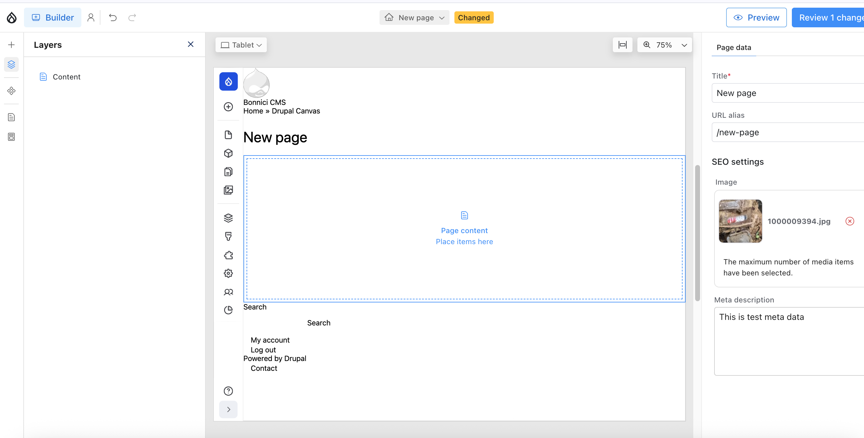
Using the Component in Drupal Canvas
Once your component is created, Canvas makes it incredibly easy to use:
1. Enable Your Theme
Make sure your custom theme containing the component is enabled. Drupal will automatically discover SDCs in your theme's components/ directory.
2. Create a New Canvas Page
Navigate to your Canvas interface and create a new page. You'll see an intuitive builder interface with:
- Page list: All your Canvas pages in one place
- Visual builder: Drag-and-drop canvas area
- Component library: Available components in the sidebar
- Page settings: Title, URL alias, SEO metadata
3. Add Your Hero Component
From the component library, locate your Hero component and drag it onto the canvas. Canvas will display it with placeholder content, ready for customization.
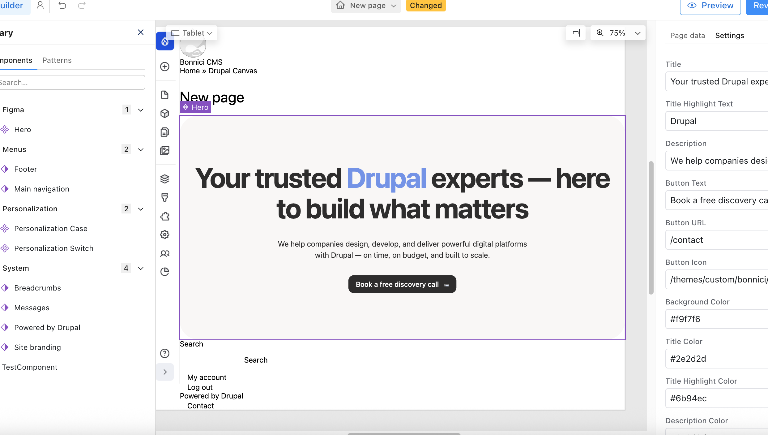
4. Configure Component Properties
Click on the hero component to reveal the configuration panel where you can:
- Set the main title and highlighted text
- Add a compelling description
- Configure the CTA button text and URL
- Customize colors to match your brand
- Add a button icon for visual interest
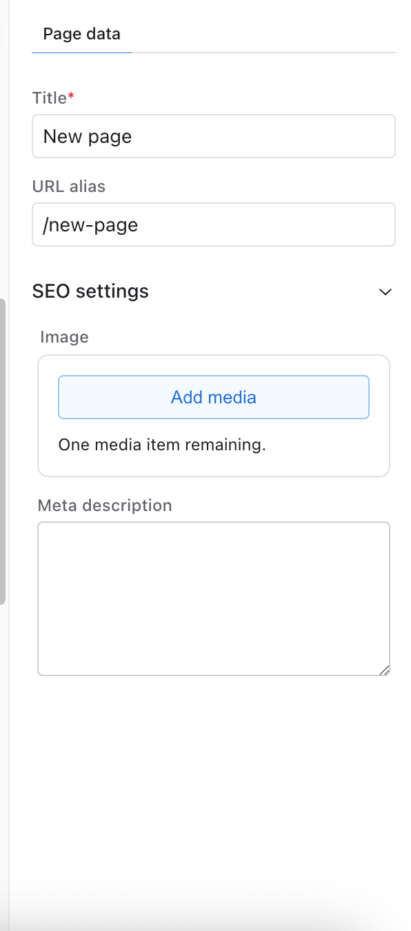
5. Configure Page Settings
In the sidebar, you can set:
- Page title: Appears in browser tabs and search results
- URL alias: Custom, SEO-friendly URL
- Meta description: For search engine optimization
- Featured image: Social media sharing image
6. Preview and Publish
Use the preview button to see how your page looks at different breakpoints. Once satisfied, click "Review changes" and publish your page.

Real-World Implementation
This hero component powers our agency's homepage, showcasing Drupal expertise with a professional, modern design. Here's how we use it:
Title: "Your trusted Drupal experts — here to build what matters"
Highlight: "Drupal"
Description: "We help companies design, develop, and deliver powerful digital platforms with Drupal — on time, on budget, and built to scale."
Button Text: "Book a free discovery call"
Button URL: "/contact"
The component automatically:
- Highlights "Drupal" in blue (#6b94ec)
- Maintains consistent spacing and typography
- Adapts to mobile screens
- Provides smooth interactions
Best Practices for Canvas Components
Through building production sites with Canvas, I've learned several key principles:
1. Design for Flexibility
Provide sensible defaults but allow customization. Our hero component has default colors but accepts overrides for brand consistency.
2. Document Thoroughly
Use the examples field in your component metadata. Site builders will thank you for clear, realistic examples.
3. Think Responsive
Test components across devices. Our hero scales from 74px headings on desktop to 36px on mobile while maintaining visual hierarchy.
4. Maintain Semantic HTML
Use proper heading levels, semantic elements, and ARIA attributes. This improves accessibility and SEO.
5. Keep Styles Scoped
Use BEM or similar methodology to prevent style conflicts. The .hero__ prefix ensures our styles don't clash with other components.
6. Optimize Performance
Keep CSS minimal, use system fonts when possible, and optimize images. Canvas pages should load fast.
Advanced Techniques
Dynamic Content Integration
You can integrate Drupal fields and entities into your SDCs:
{% if content.field_custom_title %}
  {{ content.field_custom_title }}
{% else %}
  {{ title }}
{% endif %}
Variant Support
Create multiple variants for different use cases:
variants:
  default:
    title: Default
  centered:
    title: Centered
  dark:
    title: Dark Mode
JavaScript Integration
Add interactive behavior by including JavaScript in your component directory and referencing it in the component metadata.
Troubleshooting Common Issues
Component Not Appearing in Canvas
- Clear Drupal cache:
drush cr - Verify component directory structure
- Check YAML syntax validity
- Ensure theme is properly enabled
Styles Not Applying
- Confirm CSS file is in component directory
- Check for CSS conflicts with other styles
- Use browser dev tools to inspect applied styles
- Verify BEM naming is correct
Properties Not Saving
- Validate component metadata schema
- Check property type definitions
- Ensure required properties are defined
- Review Drupal logs for errors
The Future of Drupal Site Building
Canvas represents where Drupal is heading: empowering both developers and content editors with modern, intuitive tools. By combining Canvas with SDCs, we get:
- Developer efficiency: Build once, reuse everywhere
- Editor autonomy: Create pages without developer intervention
- Design consistency: Components enforce design systems
- Maintainability: Centralized component updates
- Performance: Optimized, minimal markup
Conclusion
Drupal 11 Canvas with Single Directory Components transforms how we build websites. This hero component demonstrates the power of this approach: flexible, maintainable, and user-friendly.
The beauty of Canvas lies in its simplicity. Developers create robust, well-documented components. Site builders assemble them into beautiful pages. Everyone wins.
Start building your own Canvas components today. The Drupal community is actively developing new patterns, tools, and best practices. Join us in shaping the future of Drupal site building.
To streamline your component development workflow even further, check out our guide on automating Figma to Drupal with MCP and Cursor, or explore our thoughts on the State of Drupal in NZ to understand the broader ecosystem.
Need Help with Drupal Canvas Implementation?
Building production-ready component systems with Canvas and SDCs requires expertise in modern Drupal architecture and design system thinking. Our team specializes in Drupal development services, creating component-based solutions that scale from simple marketing sites to complex enterprise applications.
We've helped organizations across New Zealand implement Canvas-powered sites that deliver exceptional user experiences. Check out our case studies to see our work, or explore our guide on Drupal infrastructure setup for production deployments.
Resources
- Drupal SDC Documentation
- Canvas Project Page
- Component Examples Repository
- Drupal Slack #canvas Channel
Happy building with Drupal Canvas!