Drupal Canvas: 5 Tips and Tricks
5 Drupal Canvas Tips That'll Transform Your Component Game
If you haven't been living under a rock in the Drupal world recently, I'm sure you've heard all about the advent of Canvas. Canvas was built as an 18 month slog of open source collaboration, culminating in the creation of a truly modern component based page building experience and - even though it is not perfect yet - shows me enough to make me more than optimistic about Drupal's page building future.
I had the chance to play with Canvas and found it to be brilliant, once you had a design system in place. The speed (and pure enjoyment) of building aesthetically pleasing pages is a stark contrast to the traditional rigidity and dullness of page building in Drupal. Except for certain use cases of possibly Mercury Editor + Gutenberg, I have not seen an experience like this before.
Without further ado! Let's dive into the 5 patterns that I found particularly useful to build out Canvas properly.
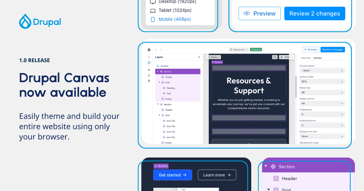
 Image credit: Drupal
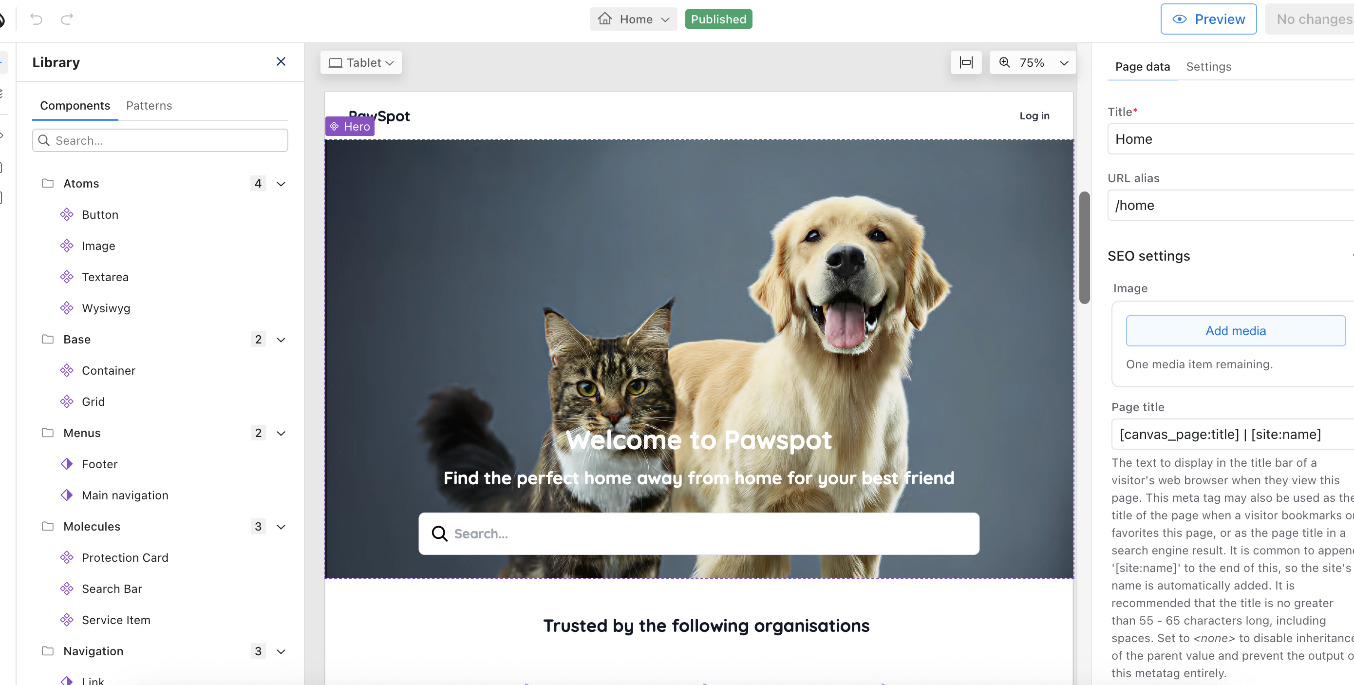
Why These Five Techniques Matter
Before we jump in, understand what makes these patterns essential:
- Slots: Enable true component composition and reusability
- WYSIWYG Integration: Give editors rich text without breaking your design
- Patterns: Save reusable component arrangements in the UI
- Code Components: Build interactive components in Canvas's browser editor
- Global Regions: Edit headers and footers once, apply everywhere
Together, these will make the backbone of your experience.
Tip #1: Master Slots for True Component Flexibility
The biggest mistake developers make with Canvas components? Treating them like static templates instead of composable building blocks. Slots change everything.
What Are Slots?
Slots allow you to place other SDC components, or any other Canvas component, inside your component. They define regions where content can be dynamically inserted - similar to React's children prop or Vue's slot system.
Slots are "areas" for free renderables only, like other components. Props are strictly typed data only, for some UI logic in the template. This separation is what makes SDCs clean, scalable, and reusable.
The Problem Slots Solve
Imagine a "Card" component with a title, description, and image. But then your designer wants:
- Cards with video instead of images
- Cards with multiple CTAs
- Cards with embedded forms
- Cards with testimonial quotes
Without slots, you create separate component types for each variation. Think back to pure paragraph days (no thank you). With slots, you create one flexible Card component that accepts different content through its slots.
Implementing Slots in Canvas
Here's a simple Section component with a slot:
section.component.yml:
$schema: https://git.drupalcode.org/project/drupal/-/raw/HEAD/core/assets/schemas/v1/metadata.schema.json

name: Flexible Section
status: stable
description: A section container with customisable background and content slot
category: Layout

props:
  type: object
  properties:
    heading:
      type: string
      title: Section Heading
      examples:
        - 'Our Services'
    background_colour:
      type: string
      title: Background Colour
      default: "#ffffff"
      examples:
        - '#f9f7f6'

slots:
  content:
    title: Section Content
    description: Drop any components here to appear in the section
section.twig:
<section class="flexible-section" style="background-color: {{ background_colour }};">
  <div class="flexible-section__container">
    {% if heading %}
      <h2 class="flexible-section__heading">{{ heading }}</h2>
    {% endif %}
    <div class="flexible-section__content">
      {{ slots.content }}
    </div>
  </div>
</section>
Using Slots in Canvas
In the Canvas editor:
- Drag your Section component onto the page
- Configure the heading and background colour in the properties panel
- Drag other components into the slot drop zone
- The Section component wraps whatever you put inside
Canvas's experimental features include slot restrictions, where the SDC itself can specify which components a slot accepts. This gives you even more control over component composition.
Multi-Slot Layouts
Create components with multiple slots for complex layouts:
slots:
  left_column:
    title: Left Column
  right_column:
    title: Right Column
  footer:
    title: Footer Area
Now you have a two-column layout where each column accepts any components, plus an optional footer slot. For example, a List component can define a slot called Items that accepts any other SDC component to display as list items.
Tip #2: Integrate WYSIWYG Without Destroying Your Design
Rich text editing is essential, but it's also where most component systems break down. Editors paste content from Word, add inline styles, and suddenly your beautiful design is chaos.
Canvas handles WYSIWYG through a specific JSON Schema pattern that gives you control.
The Canvas WYSIWYG Pattern
Canvas uses JSON Schema's contentMediaType and custom x-formatting-context annotations to enable formatted text:
text-block.component.yml:
props:
  type: object
  properties:
    content:
      type: string
      title: Content
      contentMediaType: text/html
      x-formatting-context: block
      examples:
        - '<p>This is <strong>formatted</strong> content with <a href="#">links</a>.</p>'
    text_align:
      type: string
      title: Text Alignment
      enum:
        - left
        - centre
        - right
      default: left
How Formatting Context Works
The x-formatting-context property uses CSS's existing formatting context terminology:
x-formatting-context: inline: CKEditor 5's inline editor, restricted to<strong>,<em>,<u>,<a href>x-formatting-context: block: CKEditor 5's balloon editor, allowing paragraphs, headings, and lists
This lets you define exactly what formatting capabilities editors get while maintaining your design system.
text-block.twig:
<div class="text-block text-block--align-{{ text_align }}">
  <div class="text-block__content">
    {{ content|raw }}
  </div>
</div>
Your CSS enforces typography constraints to keep everything on-brand, even if editors paste from Word.
Tip #3: Use Patterns to Accelerate Editor Workflows
Patterns are reusable arrangements of components that you can save and deploy across pages. They are the answer to reusability and save a LOT of time.
What Are Patterns in Canvas?
Pattern Components in Canvas are reusable layouts created in the UI - not YAML files you write. Think of them as component templates that editors can save and reuse.
The Canvas component library organises components into three categories:
- Block Components: Traditional Drupal blocks
- Pattern Components: Reusable arrangements you've saved
- Code Components: Custom components built in Canvas's editor
Creating a Pattern in Canvas
Here's the workflow:
-
Build a component arrangement on a Canvas page
- Drag a Section component
- Add a heading, text block, and CTA button inside
- Configure all the properties
- Style it exactly how you want
-
Save it as a Pattern
- Select the parent component (the Section)
- Right-click to open the context menu
- Select "Create Pattern"
- Give it a meaningful name like "Service Section Template"
-
Reuse the Pattern
- Navigate to any Canvas page
- Open the component library
- Find your pattern in the Patterns section
- Drag it onto the page
- Customise the content as needed
Why Patterns Matter
Without patterns, editors start from scratch every time:
- Empty components with no guidance
- Inconsistent layouts across pages
- Slower content creation
- More requests for developer help
With patterns, editors get:
- Pre-configured starting points
- Consistent design across the site
- Faster page assembly
- Independence from developers
Pattern Use Cases
- Homepage Hero Pattern: Pre-configured hero with optimal spacing and placeholder content
- Service Card Grid Pattern: Three-column grid ready to customise
- Testimonial Section Pattern: Background colour, heading, and carousel configured
- FAQ Accordion Pattern: Accordion with sample questions
The key is creating patterns for your most common page sections. This transforms the editor experience from "How do I build this?" to "Which template fits what I need?"
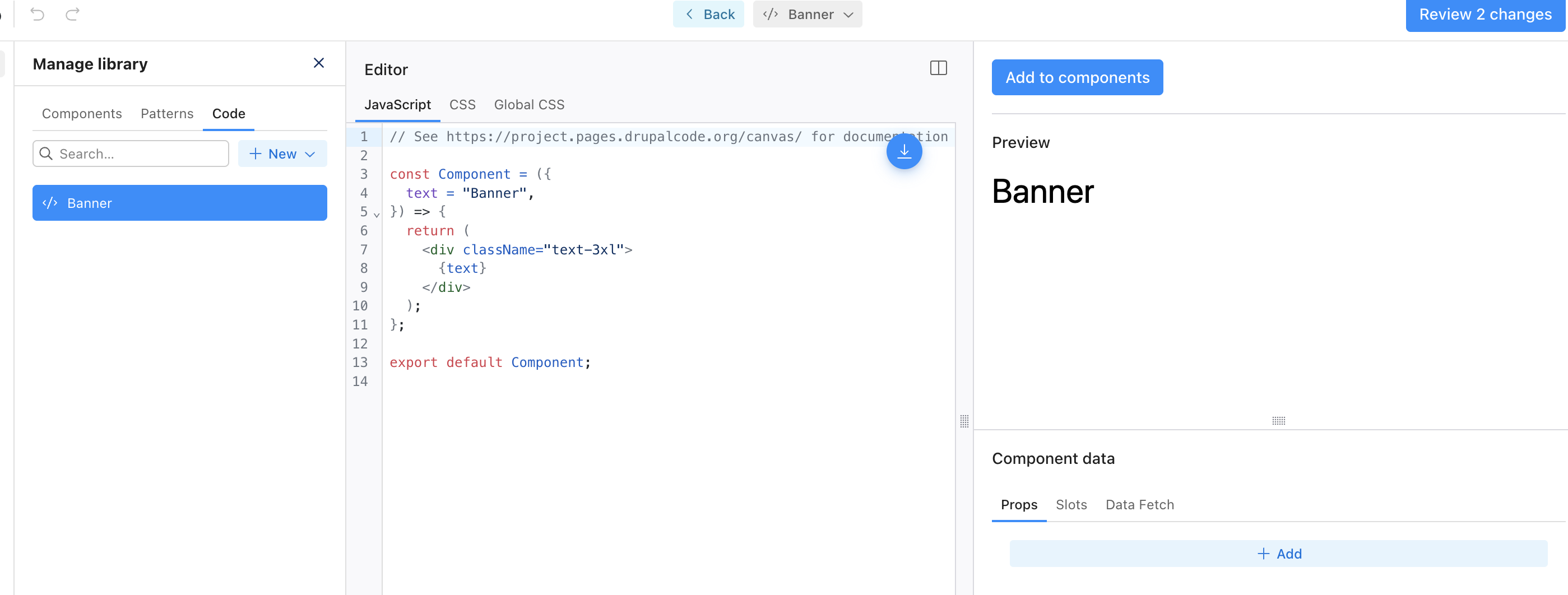
Tip #4: Build Code Components in Canvas's Browser Editor
Static components are fine for content, but modern sites need interactivity: accordions, tabs, carousels, and dynamic behavior. Code components bring JavaScript and CSS directly into Canvas.
What Are Code Components?
Code Components are components you create within Canvas for project-specific needs. Canvas has a built-in browser code editor where you can write JavaScript (JSX) and CSS without leaving the UI. This has tailwind packaged so react devs can go to town.
The code component editor has three sections:
- Left Panel: Write your JavaScript (JSX) and CSS code
- Right Panel: Live preview of your component as you build
- Bottom Section: Define component props and slots
This is fundamentally different from SDCs, which you build as files in your theme. Code components live in Canvas's database and can be edited by authorized users in the browser.
Creating a Code Component
Let's build an interactive accordion component directly in Canvas.
-
Navigate to Canvas Component Management
- Access the Code Components section
- Click "Create New Code Component"
-
Define the Component Props
In the bottom section:
{
  "items": {
    "type": "array",
    "title": "Accordion Items",
    "items": {
      "type": "object",
      "properties": {
        "heading": {
          "type": "string",
          "title": "Section Heading"
        },
        "content": {
          "type": "string",
          "title": "Section Content",
          "contentMediaType": "text/html",
          "x-formatting-context": "block"
        }
      }
    }
  }
}
- Write the JavaScript (Left Panel)
export default function Accordion({ items }) {
  const [openIndex, setOpenIndex] = React.useState(0);

  return (
    <div className="accordion">
      {items && items.map((item, index) => (
        <div key={index} className="accordion__item">
          <button
            className={`accordion__trigger ${openIndex === index ? 'is-active' : ''}`}
            onClick={() => setOpenIndex(openIndex === index ? -1 : index)}
            aria-expanded={openIndex === index}
          >
            <span>{item.heading}</span>
          </button>
          <div hidden={openIndex !== index}>
            <div dangerouslySetInnerHTML={{ __html: item.content }} />
          </div>
        </div>
      ))}
    </div>
  );
}
- Save and Add to Library
- Preview your component in the right panel
- Click "Add to components" to save it to your library
- The component now appears in your Canvas component library
Code Components vs SDCs
Code Components:
- Created in Canvas's browser editor
- Use React/JSX
- Great for project-specific interactive components
- Can incorporate dynamic elements and 3rd party API responses
SDC Components:
- Created as files in your theme or module
- Version controlled in your codebase
- Use Twig templates
- Better for reusable, portable components
Use code components for quick, project-specific interactive elements. Use SDCs for your core component library that needs to be portable and version-controlled.
Tip #5: Implement Global Regions for Site-Wide Content
Here's a problem every Canvas site faces: How do you manage headers, footers, and other site-wide content that appears on every page?
Global regions are Canvas's answer.
What Are Global Regions?
Global Components in Canvas allow you to edit headers and footers once and have them appear across all pages. This is a built-in feature of Canvas.
The beauty of global regions:
- Create your header content once in Canvas
- It automatically appears in the header region on all pages
- Edit it once, and every page updates
- Same for footers and any other global areas
How Global Regions Work
Canvas checks for global region configuration:
- If global regions are enabled: Header and footer components are placed in the corresponding global regions
- If global regions aren't configured: They're placed in the content region by default
Setting Up Global Regions
1. Enable Global Regions in Canvas Settings
Navigate to Canvas configuration and enable global regions for your site.
2. Create Your Header Content
- Open the global header editing interface
- Build your header using Canvas components:
- Logo component
- Navigation component
- Search component
- CTA buttons
- Save the header
3. Create Your Footer Content
- Open the global footer editing interface
- Build your footer:
- Footer navigation links
- Newsletter signup form
- Social media links
- Copyright text
- Save the footer
4. See Them Everywhere
The header and footer now appear on every Canvas page automatically. Edit them once, and all pages reflect the changes immediately.
AI-Assisted Global Regions
Canvas beta includes AI assistance for global regions. A form under Configuration → AI → XB AI Theme Region Settings lets you provide descriptions for different regions when global regions are enabled.
These descriptions help the AI use the regions more effectively:
- By default, only the main body is generated during template generation
- The header and footer are generated only if explicitly requested
- AI understands context like "navigation header" vs "promotional banner"
Global Region Use Cases
Site Header: Primary navigation, logo, search, user account menu
Site Footer: Footer navigation, social media links, newsletter signup, copyright
Alert Banners: Site-wide announcements, cookie consent notices, promotional banners
Persistent Sidebars: Related content widgets, advertisement spaces, quick links
The key advantage: content teams can manage these elements without developer intervention. Update the global header once, and hundreds of pages reflect the change instantly.
Bringing It All Together: A Production Example
Let's see how these five techniques work together in a real implementation.
Scenario: Building a Marketing Site with Canvas
Requirements:
- Flexible page layouts
- Rich content editing
- Interactive components
- Site-wide header/footer
- Fast editor workflows
The Implementation
1. Global Regions: Header region built with Canvas components (navigation, logo, search). Footer region with newsletter signup and social links.
2. Layout Components with Slots (SDCs): Section container (with content slot), Two-column layout (with left/right slots), Grid container (with item slots)
3. Content Components with WYSIWYG (SDCs): Rich text block (contentMediaType: text/html, x-formatting-context: block), Quote block with inline formatting, Media block (image/video)
4. Interactive Code Components (Built in Canvas): Accordion for FAQs, Tabs for product features, Carousel for testimonials
5. Patterns (Saved in Canvas UI): Homepage layout pattern (hero + features + CTA), Service page pattern (header + benefits + pricing), Product page pattern (specs + testimonials + CTA)
The Workflow
Content editors can:
- Choose a page pattern as a starting point
- Drop layout components (with slots) onto the page
- Add content components into layout slots
- Use WYSIWYG (
contentMediaType: text/html) for rich text without breaking design - Add interactive code components where needed
- Never worry about headers/footers (global regions handle it)
All while developers maintain complete control over component markup, design system consistency, JavaScript integration, and performance optimisation.
Common Canvas Pitfalls to Avoid
Pitfall #1: Over-Engineering Components
Don't create 50 micro-components. Create 10-15 well-designed, flexible ones. Use props, slots, and patterns for variations.
Bad: hero-blue, hero-red, hero-green, hero-large, hero-small
Good: One hero component with colour and size props, multiple patterns
Pitfall #2: Ignoring Accessibility
Add ARIA attributes, keyboard navigation, focus management. Screen readers matter.
Pitfall #3: Not Using Patterns
Patterns are the difference between "editors struggle" and "editors fly." Save common arrangements as patterns immediately.
Pitfall #4: Mixing Code Components and SDCs Randomly
Have a strategy: Use SDCs for core reusable components, code components for project-specific interactive elements.
Pitfall #5: Forgetting Examples
Both SDC props and code component props should have examples. They guide editors and serve as documentation.
heading:
  type: string
  title: Section Heading
  examples:
    - 'Our Services'
    - 'About Our Team'
Conclusion
Finally Drupal will have an opinionated page building experience. Drupal will finally have an identity and I didn't even start on AI. For teams willing to embrace modern component architecture sooner rather than later, Canvas delivers an exceptional development experience which will only expand.
These five techniques - slots, WYSIWYG integration with contentMediaType, UI-based patterns, browser code components, and global regions - transform Canvas from an interesting experiment into a production-ready system.
The architecture is sound, the patterns work and your future self will thank you for learning Canvas now rather than playing catch-up in two years when it's the standard.
For more Drupal insights, check out our guide on building a Canvas hero component, explore AI quick wins for Drupal, or read about the state of Drupal to understand where the ecosystem is heading.
Need Expert Canvas Implementation Help?
Building a production-ready Canvas component system requires architectural planning and modern Drupal expertise. Our team specializes in Drupal development services, creating component-based solutions that scale from marketing sites to complex enterprise applications.
We've helped organisations implement Canvas-powered sites that deliver exceptional editor experiences while maintaining code quality. Explore our case studies to see our work, or learn about our approach to Drupal development best practices.
Resources
- Canvas Project Page
- Canvas Documentation
- SDC Slots Documentation
- SDC Props Documentation
- Code Components Guide
- Single Directory Components Documentation
- Drupal Slack #drupal-canvas Channel
Ready to level up your Canvas game? Start implementing these five patterns today.